Contributed by ADITI NAGPAL
While enjoying my vacation at home, I happened to come across a very interesting series on Bloomberg UTV by the name of "Beyond Logo”. Why I am mentioning it here before starting my article is because all I write here is completely derived from the series and no contribution whatsoever is there from my side in it except a viewpoint in the end. It talked about how Cafe Coffee Day had undergone a logo transformation recently and how the chain has come to be recognised as providing a complete social hub experience through its new logo. It had become a symbol of one-stop chat and enjoyment for youngsters years ago when it was established but now the new logo has even managed to attract corporates to its fold with a plethora of deals signed under its roof everyday.
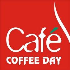
While the old logo was in a square box, the new logo appears as that of a dialogue box creating a greater conversational effect on its audiences.
 |
| THE OLD LOGO |
 |
| THE NEW LOGO |
With Starbucks announcing to make its entry in India with Tata Coffee and Hindustan Unilever deciding to launch "BRU World Cafe", will the competition eat up the home grown coffee chains and is that a reason for logo change? No, according to K.Ramakrishnan, the CMO, Cafe Coffee Day. Because according to him, there are enough coffee chains already existing in the market namely Barista Lavazza, Costa Coffee and The Coffee Bean and Tea Leaf to give CCD its run for money. The market itself, he claims, is far from saturation even in the metro cities. With all the coffee outlets combined in Mumbai coming out to 250, the number itself stands quite less in comparison to the suburbs of this metro, let alone the colonies and the societies within each suburb. Further, according to his explanation, all these outlets have just been able to cover close to 180 towns and the number of towns existing in the country is too huge. So there is enough scope for each of the existing chains and also the new entrants to venture into the underutilised and unutilised space going forth with more and more chains in the towns where little exist or where none exists. Currently CCD has 1080 outlets across India and Ramakrishnan describes CCD as provider of a cafe experience which has led people to reduce their entertainment and enjoyment distance from inter-city distance to intra-city distance to walking distance and then to arms length distance. What it means is people are seeking their valuable time (spent with friends) at arms length distance today.
Whatever the CMO says, changing of the CCD logo has indeed come considering the competition in its wake, according to me. Ramakrishnan, who may not be ready to accept it today, maybe will do it later after the flip phase is over.
The findings of the flip revealed by CCD after the flip of close to its 350 cafes concluded that the flip has helped to increase the residence time of an average customer in the flipped cafes in comparison to the non-flipped ones. Further, the average growth rate of flipped cafes has increased by 15% yoy in comparison to the non-flipped ones, declaring it a success any day. The results clearly indicate that an effort is being made in the direction of making CCD a provider of a complete “social hub experience” in parallel to the Starbucks aura of aspirational appeal and global experience.
Adding onto these efforts of repositioning, introduction of new format outlets by the names of “COFFEE DAY LOUNGE” (the first few have opened quite recently) and “COFFEE DAY SQUARE” catering to local populations and having customised menus are being planned as well. (The company plans to introduce 65 lounge outlets of 1200 sq feet and 8 square outlets of 2000 sq feet area in the first phase in the non-metro cities of Bhubhaneshwar, Durgapur and Ranchi to start with).
One step at a time, CCD has big plans to increase its appeal, to garner unutilised space and to face the competition….and indeed a day will come when K. Ramakrishnan will look back and say that “the flip” was a right FIRST step in the RIGHT direction!!!After all, a lot can happen over a cup of coffee!!!

